
Problem Brief
Humans often feel depressed thoughts which in some cases leads to suicidal thoughts or even actions! In 2020, the CDC reported that 1 out of every 6 adults (16.5%) in the U.S. is taking some type of prescription for mental health. We tend to keep these emotions and feelings to ourselves because it can be uncomfortable to share with others. Our goal for Pronto is to solve this problem by sustaining a fully anonymous video/text chat application where users feeling depressed can talk to verified users their age or medical professionals who can understand them.
In today’s day and age, there are lots of mental health concerns over a mass amount of media exposure - especially for adolescents. Apps and sites that offer one-on-one conversation like Omegle have proved to be ineffective and toxic methods of speaking with others. While the site does allow you to refine the people you’re able to talk to, the level of security on the site makes it difficult for people to take their time and communicate their feelings with another human - let alone have a conversation for over 20 seconds. Pronto is the solution to this problem because we allow the user to connect with someone who can put themselves in their shoes, and ultimately sympathizing with the user to deescalate the situation; whether it be a medical professional or a verified 14-year-old user.
The Design Process

Empathize
We began by looking at reviews of related chatting services and creating an online survey to better understand the issues that users are having. While conducting this research we interviewed a pediatric pharmacist, a psychologist, and an international student. The results ultimately showed us that users recognize there is a problem in seeking help with issues related to mental health. They don't feel that there is a secure safe place that allows for them to genuinely open up about their problems.


Screenshots of data pulled from the survey
Define
Next, from the pain points we gathered my team began to create two user personas. By taking into account the results from the survey as well the interviews conducted, we were able to create a realistic representation of the audience. This allowed us to better understand the user's needs, preferences, and pet peeves surrounding mental health.


Primary User
Secondary User
Ideate
With the research conducted so far, we reassessed possible solutions including a website, graphic novel, hotline, and mobile application. My team came to the conclusion that a mobile app offers much more versatility in terms of the number of users it can reach. We learned that these issues of mental health are most prominent in teenagers who use their mobile devices constantly already. The most efficient way to reach our audience is by creating an application for a device they already use every day. The key features that are essential to the app include a secure environment with anonymity, free instantaneous voice/video/text chat with medical professionals & peers, and a hashtag messaging feature where you can choose or create a hashtag and will be placed into a group message with individuals who chose the same tag.


Pronto Site Map
Sketch of the interface for Tags page
Prototype
Since I had the design role for this project the next steps consisted of me taking all of our ideas and formulating a rough sketch to encapsulate all of the necessary features. I made sure throughout this process to thoroughly check similar mobile apps and their reviews for insight on what to avoid and what to integrate into pronto. It was then that we settled on the color palette for our application, user reviews along with physiological findings showed that pink elicited less anxiety/anger than blue or white. The grey and off-black allow for softer tones to compliment the vibrant main color pink.


Color Palette
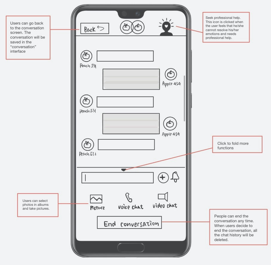
Low Fidelity Mockup of Public/Private Chat Interface
Test
Once having our ideas drawn out we were able to experiment and test different features that would further enhance the user experience. My team then took our skills to Figma where we coordinated design plans via a Skype call to begin creating high fidelity wireframes. We began to reflect on the wireframes and take note of how we could refine them to keep the experience seamless. The product of this process was a fully interactive mobile application by the name of Pronto.
"How can users connect with others who share common interests?"
We integrated a hashtag channel that allows users to choose hashtags pertaining to their mood and they will be placed into corresponding group chats. You can select from the already created tags or create your own and have people join. This keeps the platform interactive without compromising security.

"What if there is not an abundance of medical professionals for free?"
We plan to integrate advertisements into our application and use the ad revenue to fund free medical professional resources for users.


"What is your plan to combat bullying & harassment on Pronto"
A fully functioning report system grants users the ability to ban a user indefinitely if he has violated community guidelines. This ban will be investigated within 24 hours by customer support and a verdict on whether the ban will be lifted or not will be made. Intentionally falsely reporting a user will result in the permanent termination of the offending user's account.
Reflection
With this being my first large scale project, I was really able to dig deeper and better grasp the design process as a whole. I learned how to create effective user personas using data from user research as the foundation. My favorite part of this project was refining the wireframes and seeing our final product come to life. This process as a whole furthered my understanding and experience with human-computer interaction and not to mention I had a blast collaborating on it with my peers!
With more time, some features I'd like to explore to further enhance Pronto's experience include:
-
A match page where users can swipe right and left on other users based on their interests. Users who swipe right on each other will be matched and they can begin chatting.
-
A short mandatory mental health check that gauges the mental state and well-being of the users daily.
-
Group video calls between users and even medical professionals to enhance community support