top of page
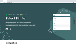 |  |  |  |
|---|---|---|---|
 |  |  |  |
 |
Overview
Overview
-
In the past 5 years, Oracle has been undergoing a big shift in its brand identity
-
As a result, the Redwood Design System (RDS) or (ROC) was developed
-
It documents up-to-date guidelines for every component used to build Oracle apps
-
It also allows internal/external users to build designs consistent with Redwood
12 weeks
2 UX Designers
Design Systems
Interaction Design
The Problem 🚩
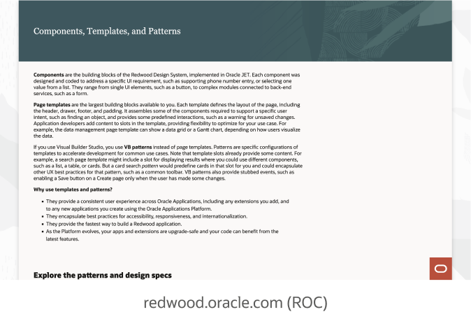
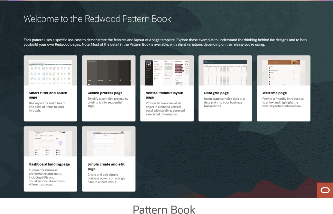
Users of the Redwood Design System (RDS) have expressed difficulty determining the correct components for their use cases due to multiple sources of information that can be contradictory, overwhelming, and difficult to consume



The Solution ✨
Our hypothesis informed by leadership was that by combining our guidelines with interactive experiences (such as content chunking and progressive disclosure), we can enable users to better understand guidelines for components/templates and correctly use them in their design.


Go-live 👍
One of our proposed solutions got approval to be handed off for development. It just reached go-live status and is viewable at redwood.oracle.com
Why Interactivity❓
Our initial competitive analysis revealed that only 2/6 major competitors were utilizing interactivity to display component functionality.
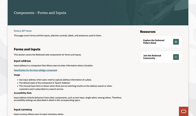

Before our solution was implemented
The Approach ✍🏽
Research
After our solution was implemented
The Numbers 📈
I felt so overwhelmed by the amount of information and interconnected parts of the problem that I just needed to hear a clear definition. I wanted to know the audience I was designing for, so I slacked a Sr. Manager asking for access to the analytics behind our internal RDS Figma Toolkit. I was shocked at the plethora of data. What stood out to me was the number of times our components were copied/pasted into Figma files across Oracle.
657,000
July 22 - July 29th
insertions from Figma UI kit
1.1M
Aug 22 - Aug 29th
insertions from Figma UI kit
53%
increase in activity in the last 30 days
I coordinated meetings with UX Researchers to review 2 of their prior studies centered around improving Redwood guidelines. The hope was to better understand the problem space, but this left us with more questions than answers.


So naturally I wanted to talk with those facing these issues (UXDs, Devs, PMs). I conducted 13 preliminary interviews that ultimately revealed: users wanted a one-stop shop to answer their questions in a timely/seamless manner.


However, I was hesitant to jump at the qualitative user feedback. I never make decisions solely on what users say or solely on what the facts are. We needed more quantitative insights to make a holistic assessment of the problem. So I organized an additional 7 interviews with questions more focused on generating valuable data (i.e. task-based questions)
0%
of users had a positive experience looking for guidelines
85%
of interviewees thought there was too much text
1:12 min
Avg time to complete a task based question (one user took 4:21)

With this new finding, we decided to shift our approach in solving this problem to focus on primarily aiding Designers, while not excluding PMs or Devs. With a more clearly defined user group, we were able to better cater to the direct stakeholders needs. In doing so, we uncovered many "problems within problems" and having a clear understanding of the audience aided greatly in prioritizing what to solve and defining what was out of scope.


Ideate
Ideation 💡
At this point I held a solution workshop with stakeholders to brainstorm "How might we..." questions and ideate on solutions to them before grouping into themes. We then voted on the top 3 themes that encompassed the key pain points from user interviews. Additionally, we held a sketching workshop with stakeholders to align and ideate on a solution for the selected themes.
01
02
03


Story Based Choosing
Tell Me Why
01


Show Related Components
Human Language Form
For the story based choosing theme we designed a Human Language Form that integrated with our "AskOracle" search.
Feedback from leadership was that the solution was out of scope. Our focus was supposed to be on how to use not how to choose components. In summary, we needed to better facilitate a learning experience for our users.
Interactive Guidelines (mild)
We shifted to a more conservative approach that was consistent with Redwood. This entailed a renovated design centered around a tabbed layout to scaffold out information.
This design featured interactive widgets throughout the page that allowed the user to learn while interacting with the content which users reported was much more engaging.
check out an example here!
02


But Feedback from Leadership 😬
We adhered to the Design System as intended, which isn't inherently negative. However, we were overly conservative in our designs when there was room for more aspirational approaches. As interns at Oracle, we have freedom to propose wild designs without much pushback. On the other hand, full-timers are required to follow Oracle's Design System guidelines, with minimal deviations allowed.

Prototype
Initial Wireframes 📝
After receiving this news, we had 2 weeks to redesign this entire experience and have a high-fidelity prototype ready. At this point I was questioning my capabilities, my career choice, whether I was good enough to work at Oracle. I felt like I was in way over my head, so I met with Sr. Visual Designers to assist in providing clarity. They articulated the importance of grids, and helped us ideate on grid based layouts for our new design. Based off our meeting with leadership & stakeholders, I decided to abandon the tabbed layout in favor of a single page, immersive experience with parallax scrolling.
Review & Refinement 📐
With only 7 days remaining, my teammate and I conducted a design sprint to evolve our low-fidelity design into a high-fidelity prototype, showcasing an end-to-end flow. This effort was responsible for garnering such valuable feedback from user testing. Within just a few days, we had a ready-to-test prototype at hand.
Key Findings 🔑
Test
We conducted a user study with 3 designers, 2 devs, and 1 PM that revealed a sizable amount of problems with the design. With less than a week left to iterate on the prototype, I created a scoring system to prioritize issues that our users expressed. Moving forward, we had a clear alignment on the "value add" proposition of each suggestion and understood whether it was worth our time investment. This was crucial in ensuring the needs of our users were being properly met despite the time constraint.


Users failed to identify the 2 types of our Select Single component
Final Solution 💻
Applying all of the most important suggestions from users, we were able to build a more user-centered solution leveraging affordances through cursive coach marks. This aided in illustrating a human-like experience relative to the core values of Redwood, while also solving some less prominent pain points felt by users (Impact 2's & 3's). It was crucial to utilize interaction by making the guidelines dynamically update as the user clicks on different elements to take the stress off reading and make it a more scannable.
*Tip: Use your arrow keys to navigate down to each section of the page
Impact 📊
To measure the impact of our designs during user testing we asked the same questions from earlier interviews to compare the percentage differences in our findings. My teammate was hesitant to incorporate KPIs due to their lack of knowledge in the area, so I took the lead in creating KPIs to test the solution against.
Impact
Before solution
0%
of users had a positive experience looking for guidelines
After solution
100%
of users had a positive experience looking for guidelines
+ 100%
increase
3.5/5
Avg self reported comprehension rate of the guidelines
4.5/5
Avg self reported comprehension rate of the guidelines
+ 28.57%
increase
1:12 sec
Avg time to complete a task based question (one user took 4:21)
20 sec
Avg time to complete a task based question (one user took 90s)
- 72.2%
decrease
“This is really sick, I like this this... if you’re learning about a component it makes sense”
“I think its a lot more usable than having a pdf”
“I really like how it looks and it seems easy to use, easy to find stuff”
Next Steps 👣
With limited time being an overwhelming constraint, with more of it I'd like to explore
-
Applying our templated design to other RDS components to validate it further.
-
Conducting an accessibility audit to ensure our proposed solution is WCAG 2.0 Level AA certified and usable
-
Additionally, recruiting a more diverse user group for the next user test (more external & international users).
Reflection & Takeaways 💭
Solving enterprise software problems is complex. One of the main struggles throughout this project was wrestling with the limitations/ways our work intersected with other lines of business and workflows. We were told to keep a "blue sky" mind when designing yet week after week it felt like we were being siloed into a predetermined solution due to factors outside of our control.
All of the confusion left the air when we met with our Vice President of User Experience to receive feedback on our "mild" design. Our VP redirected our focus to the core of the problem by articulating it in layman's terms. My teammate and I, after being involved in too many technical/ambiguous conversations, simply needed to hear a dumbed-down version of the problem space to realign ourselves to the issue at hand.
This project allowed me to jump into complex problems head first, which heightened my nature as a curious individual. I loved every second of it! For instance, in our weekly informational workshops, we got to meet many amazing leaders across our organization and learn strategic skills from them such as storytelling, data-driven design, business metrics, etc. Moving forward, I have a revitalized set of tools that'll enable me to tackle the next problem meticulously!
bottom of page